Charts
The MCP Server’s Visualisation Studio lets the AI build reusable chart definitions straight from your Odoo data, preview them, embed them into Shared Pages, and tweak them over time. The chart engine renders with Apache ECharts under the hood and supports 9 chart types out of the box.
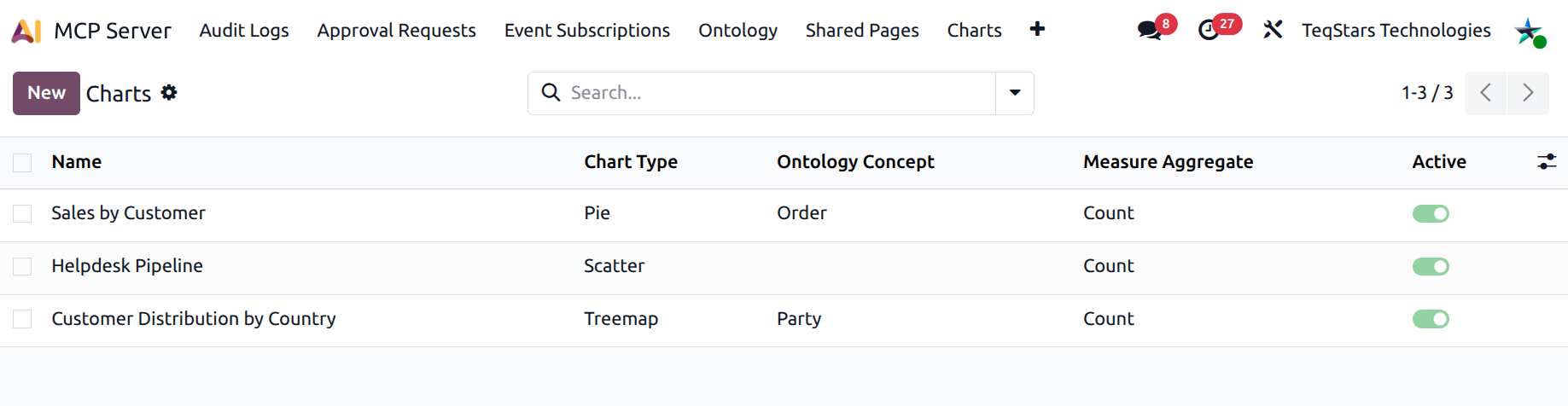
Where to find them
. Each row is an
mcp.chart.ts record.
How charts are created
There are two paths:
AI-created — the user asks Claude / ChatGPT / Cursor “show me revenue by salesperson last quarter”. The AI calls
generate_chartwhich inserts anmcp.chart.tsrow. The Chart form displays the originating connection in the Created by AI Client field.Hand-authored — an admin opens , fills in the form, and saves. The Created by AI Client field stays empty.
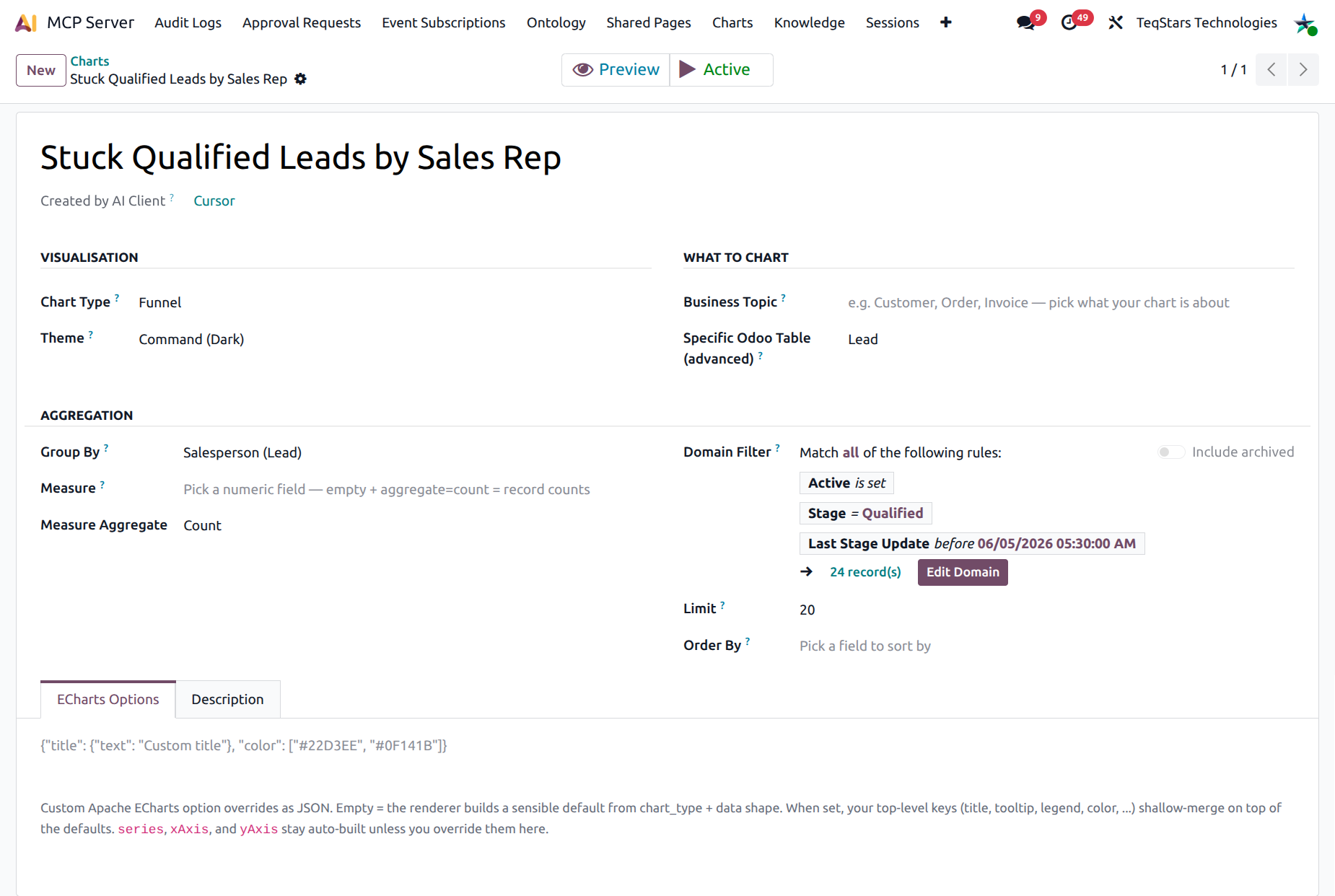
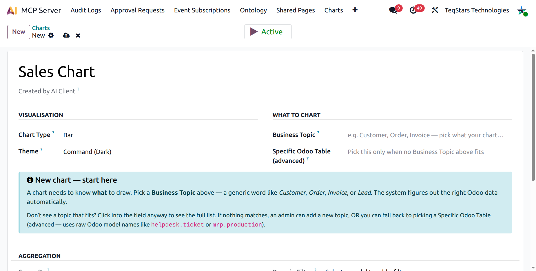
The Chart form
Visualisation
Chart Type — bar, line, pie, scatter, gauge, radar, funnel, treemap, or sunburst.
Theme — command (dark) or light.
What to chart
The chart needs to know what to draw. Two ways:
Business Topic (preferred) — pick from the Ontology Concepts (Customer, Order, Invoice, Lead…). The same chart definition works across tenants because the ontology mapping picks the right Odoo model per company.
Specific Odoo Table (advanced) — pick a raw model name (e.g.
helpdesk.ticket,mrp.production). Use this only when no Business Topic fits.
A guidance banner appears under this group while no source is picked — it walks new users through their first chart.
Aggregation
Group By — the field used to bucket records (e.g.
country_id,date_order:month). Empty = a single KPI bucket.Measure — the numeric field to aggregate (e.g.
amount_total). Empty + aggregate=*count* = record counts.Measure Aggregate — count, sum, avg, min, max.
Domain — an Odoo domain filter (the editor widget is pre-bound to the chosen target model).
Limit — max number of buckets to draw.
Order by — pick a field and direction, or write a multi-field sort by hand.
ECharts options
Under the ECharts Options notebook tab you can paste arbitrary Apache ECharts JSON to override the auto-built configuration (custom titles, colours, tooltips, legends…). The renderer shallow-merges your overrides on top of the default option. The default styling is intentionally polished — leave the field empty unless you have a specific reason to customise.
Description
Free-text note about what the chart shows, who it’s for, and anything a future editor should know.
The chart tools
generate_chartCreates a new chart definition. Returns
chart_idplus a clarifyingask_userprompt. The AI always asks the user what to do next — render now, share as URL, or both.update_chartPatches an existing chart. The AI calls this when the user iterates (“make it a line chart instead”, “filter to last 90 days”).
compose_chartRenders the chart as HTML + a structured
data_pointspayload for inline display. After rendering, the AI asks whether the user wants a public share URL.save_chart_as_pagePersists the chart as a token-gated public URL anyone with the link can open. See Shared Pages.
Search filters
Active / Archived
With Ontology Concept / With Fallback Model
Group by Type, Ontology Concept, Theme
Tip
Once the AI has built a chart you like, you can pin it into form views (smart button), into the Knowledge Base docs, or share it as a public URL — without ever rebuilding it.